‘Six degrees of separation’ sprang to mind at the launch of Soft Landing which runs at Wimbledon Fine Art until January 6th. Introduced by mutual friends at the private view, it later turned out that artist and erstwhile musician Zoë Kronberger and I had already met, years earlier, at a party at her cousin’s house, which was just over the road from mine – her relative’s presence at the show brought the memory flashing back. The six degrees theory is doubly relevant in that its proponent, the Hungarian writer and poet Karinthy Frigyes, also referenced the concept that ‘art cannot exist without science’ in his thinking – and this quote happens to be particularly resonant in Zoë’s oeuvre.
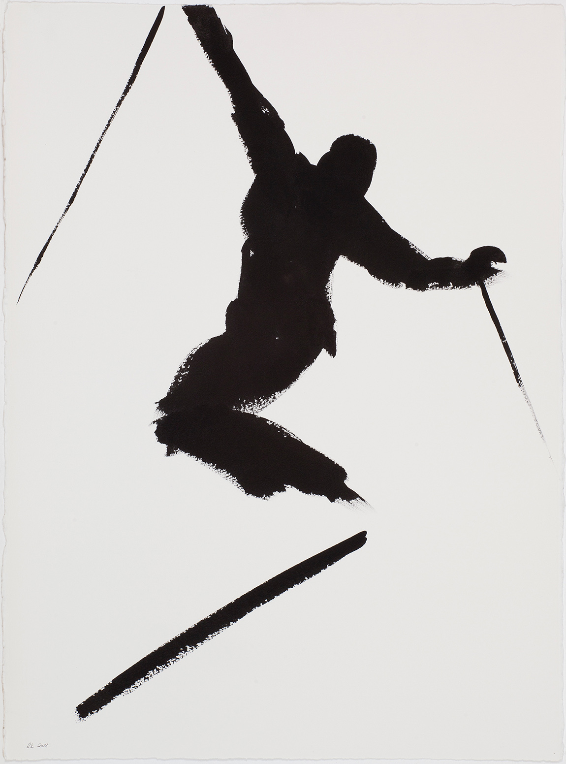
GLORIA, ink on paper (750x550mm) I love the idea of exaltation – and so here it is – a massive release, and who can forget the Van Morrison song … « she yell what I yell… GLORIA » ?
Her father was an Austrian émigré and nuclear physicist, her mother a nurse, and both music and art played a large part alongside scientific investigation in the Kronberger household. These early influences, together with her parents’ love of mountaineering, dance across the landscape of Zoë’s artistic output. There is a rigour and a precision to her work combined with natural rhythm and fluidity. Some of her marks are reminiscent of musical annotations, others appear to be mobile, like free flowing sounds – cleverly structured yet undulating and organic. Although largely based in France, dividing her time between Val d’Isère and the Vaucluse, as well as London, she has a loyal following in Britain, as witnessed by private view guests who travelled from far and wide to attend the show.
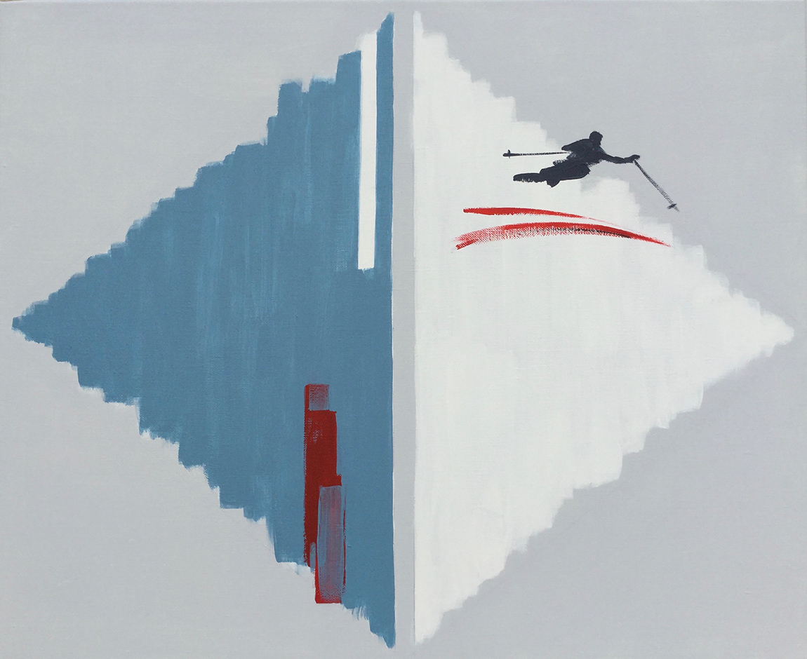
GEM, 2017, acrylic on canvas (500x610mm) Gem is so titled because I had the idea of the cutting of precious stones; the skier is possibly etching or chiselling the surface. The symmetric design of this split diamond shape is one I find fascinating with the endless possibilities of colour and position. I use what seems to be the natural accumulation of energy in the blank space between the two triangles. The placement of the skier is always crucial and therefore exciting too.
Zoë enjoyed a successful career as a musician prior to dedicating herself to painting. The visual arts were never far away though and by 2000 became the main focus of her creative endeavours. The landscape and skiing at Val d’Isère, the famous alpine resort where she initially settled in 1990, was and remains a huge source of inspiration. A quote from Hard Drive, a monograph which was produced by Kehrer Germany, to coincide with an eponymously named exhibition in Kitzbühel in 2012, sums up Zoë’s passion:
“For me, mountains mean the unfolding of never-ending passages and summits, and of endlessly deceptive perspectives, colours, contrasts, forms and horizons. It is a tough environment that is always bringing you close to the essential edge of things and it is totally addictive.”
I interviewed Zoë after the Soft Landing opening in order to explore some of the thinking behind the paintings. I chose 6 artworks, each forming its own narrative, as the focus for this review. Zoë’s competence in depicting the human form is clear, with artful captures of the varying poses that are part of the skier’s natural repertoire; slalom moments, jumps and instants of pure elation. Her ability to define space and motion in just a few strokes is compelling.
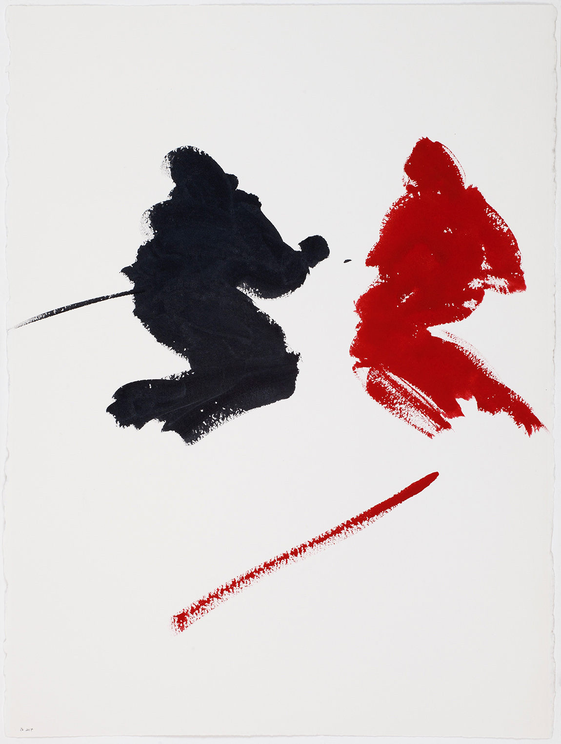
CHECKMATE, 2017, ink gouache on paper (750x550mm) Checkmate is the type of painting that is chiefly concerned with balance, design and attracting and repelling force. I like to use the couple of skiers because it throws up a dialogue and therefore dynamic between the two figures, who are therefore not only contending with gravity. This type of work is challenging in the way that what you must leave out is the key. Regarding the materials – it is hard to see – but the dark figure is not pure black – it has a subtle dose of silver added so that when viewed you see a dense, low mineral sheen.
My chosen paintings include a couple featuring dynamic skiers shaped by sparse, confident brushstrokes that suggest the bold visuals of a graphic designer. Entitled Checkmate and Gloria they are in gouache and ink on paper. Gem, an acrylic on canvas, plays across two contrasting triangular shapes that could be sky and mountain, slashed with minimal colour, and a skier gliding out of the snowy frame.
Another acrylic on canvas, Blue Genes, combines a pair of linked paintings in enveloping tones with clustered figures – I was drawn by the depth of the layered colour, in warm shades of blue, and the interconnected canvases. My next choice, Scirocco is a symphony of finely annotated ink gouache on paper – a sheet of music masquerading as a slope perhaps, shimmying under fine powdered snow and punctuated by the tiniest of skiers? Its title alludes to movement and every inch of the canvas defines that, whilst also conveying stillness.
Music and Light, 2017
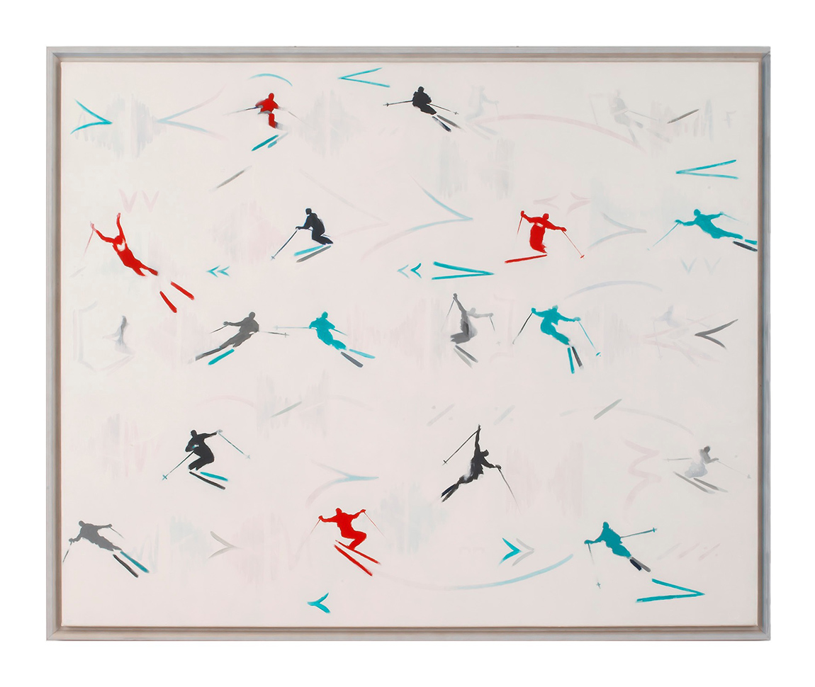
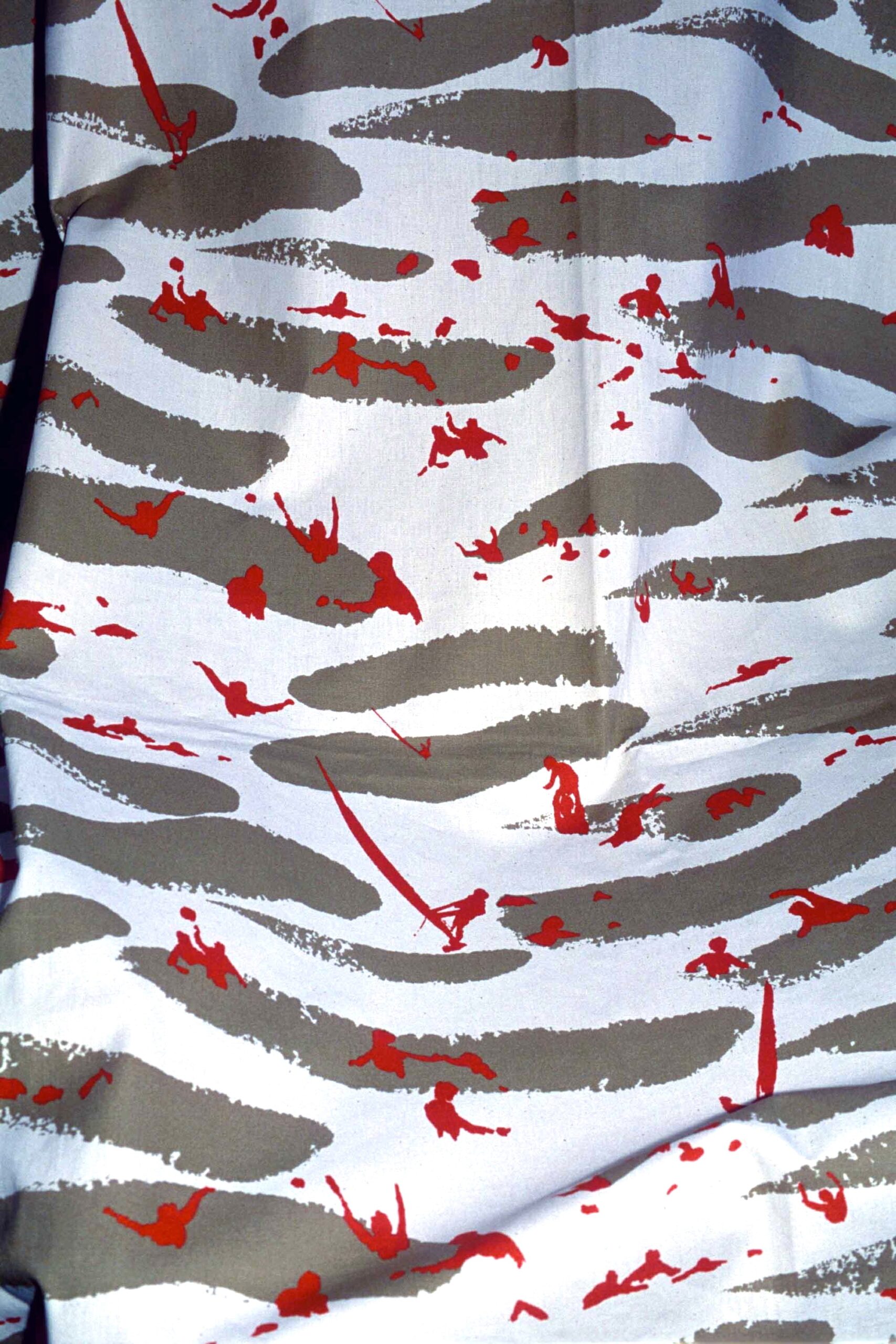
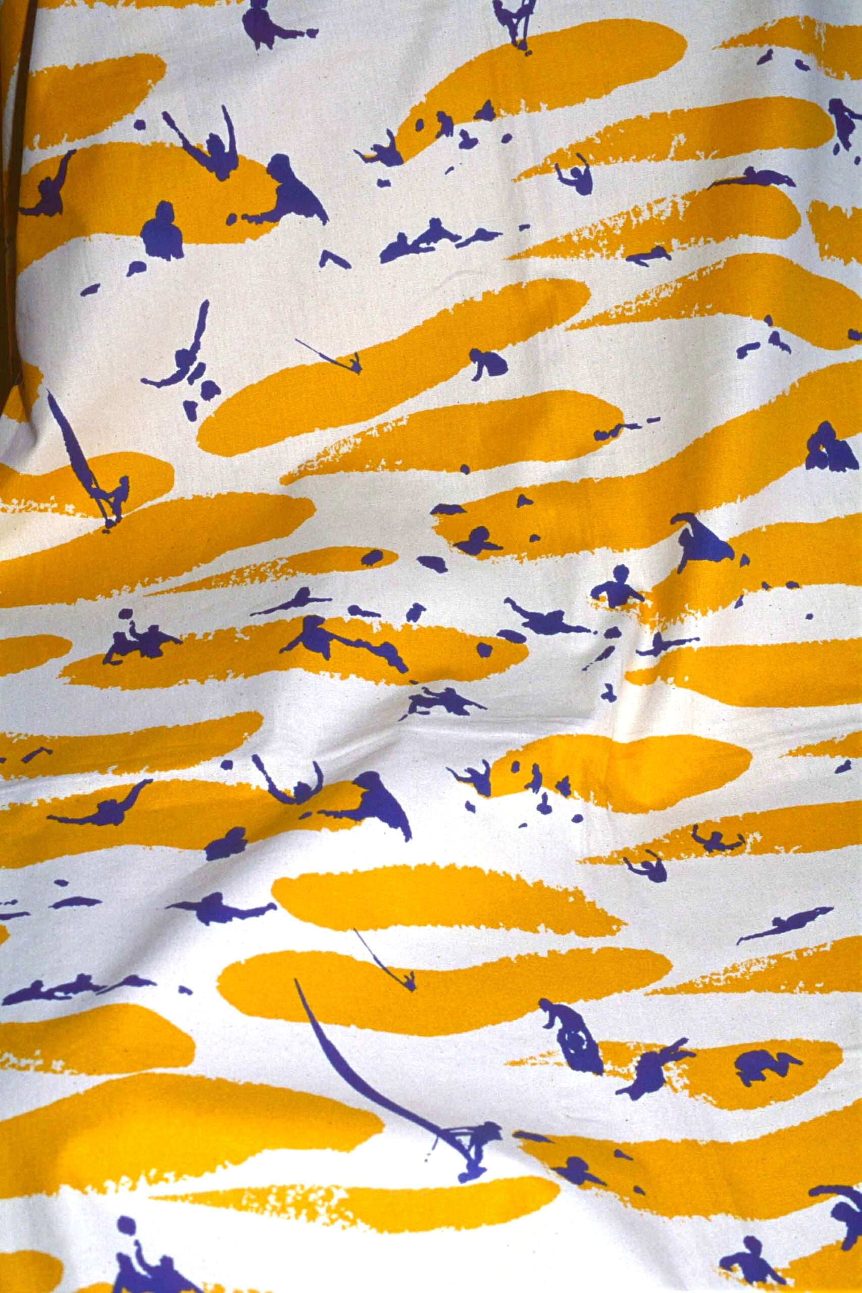
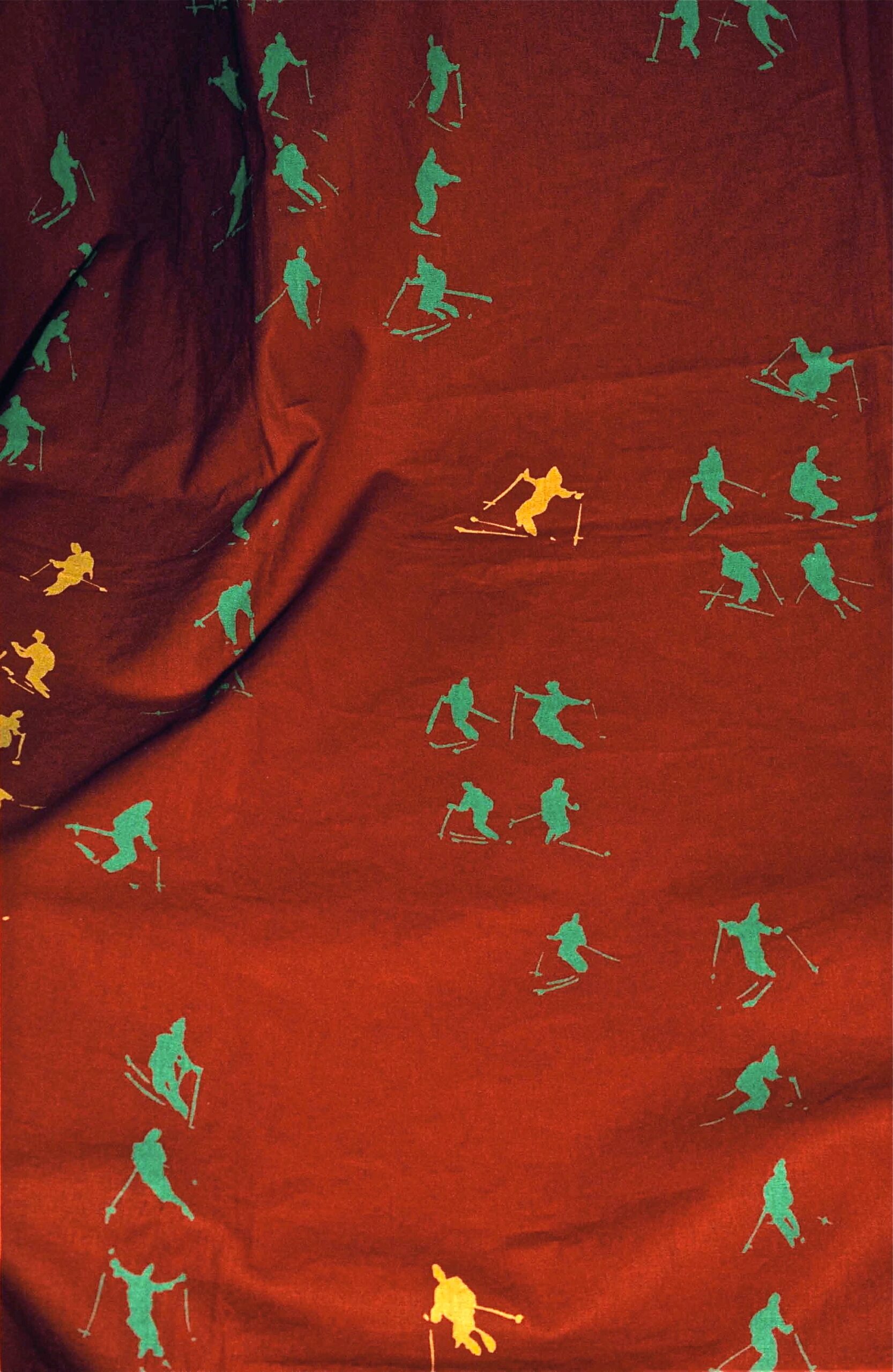
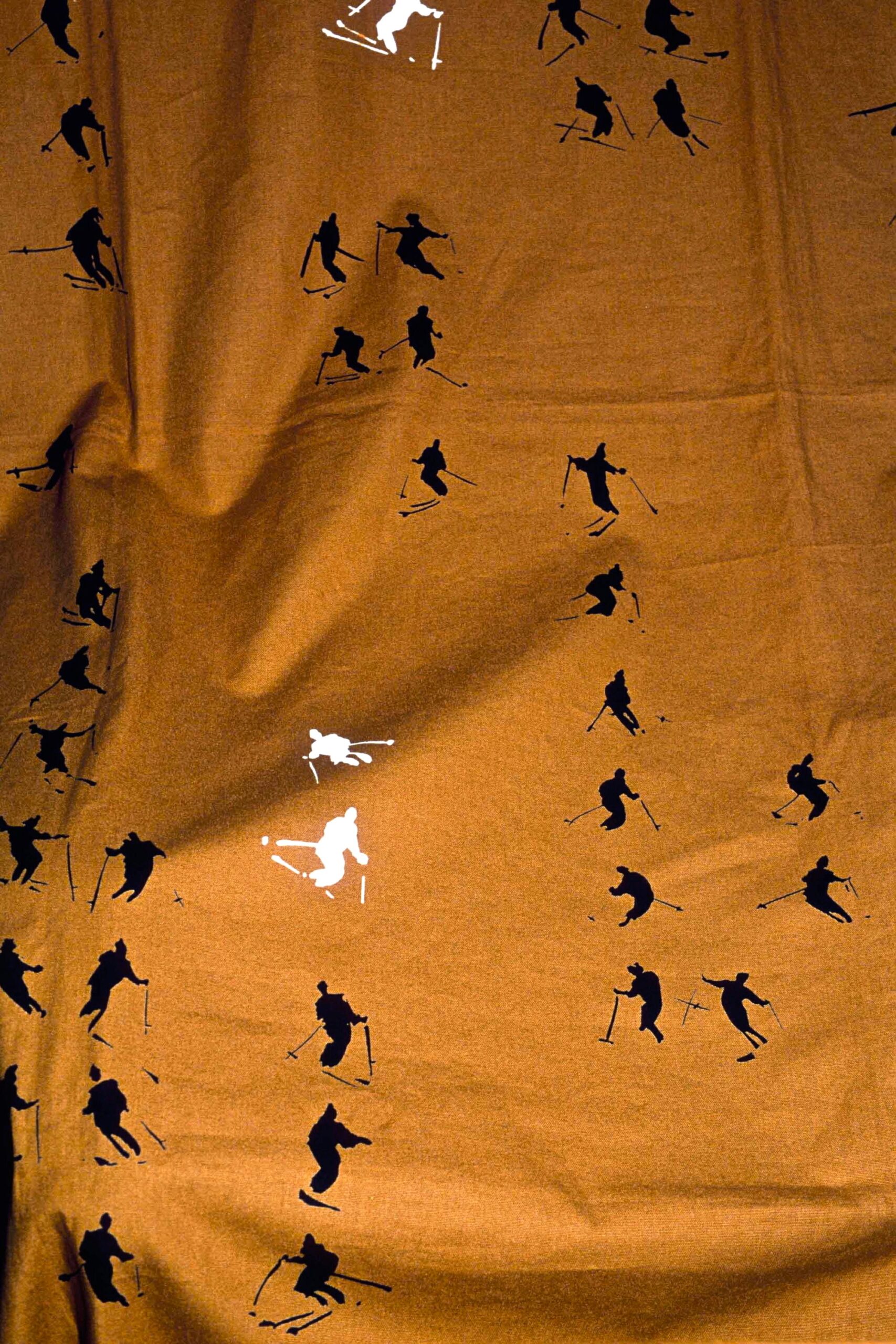
My final selected painting, another acrylic on canvas, Music and Light, is also graphic, with colourful skiers in geometric formations, creating a vision of a busy slope that also balances into a cohesive pattern. It must have been this combination of energy and a deceptively relaxed approach to composition that led the celebrated French design house, Pierre Frey to pick a couple of Zoë’s paintings to develop as fabrics. Val d’Isère and Biarritz, named after a second famed French (seaside) resort, were launched in 2000, and formed part of interior company’s collection until 2007, each available in 3 colourways.
The Soft Landing works blend figurative and abstract, drawing the viewer into the picture in a joyful, engaging manner. Read Zoë’s enlightening comments in the paintings’ captions and below, her response to my interview questions.
Memories of your earliest daubs/artworks?
“Too many to describe, but at first to make the family laugh I used to draw figures, invent silly diagrams and industrial complexes. I also enjoyed making my own maps.
I found I liked to draw and paint alone from an early age, probably before I could write. But I remember a moment very distinctly when I was around ten years old and making one of my first pieces in oil. It was from life and contained a silver birch tree in our garden in the UK. It had snowed, a rare occurrence, and the whites were set off against a heavy, gunmetal grey sky. It just got me wild. I can still see and ‘smell’ that piece. That was it. It was a “space” where I loved and needed to be.”
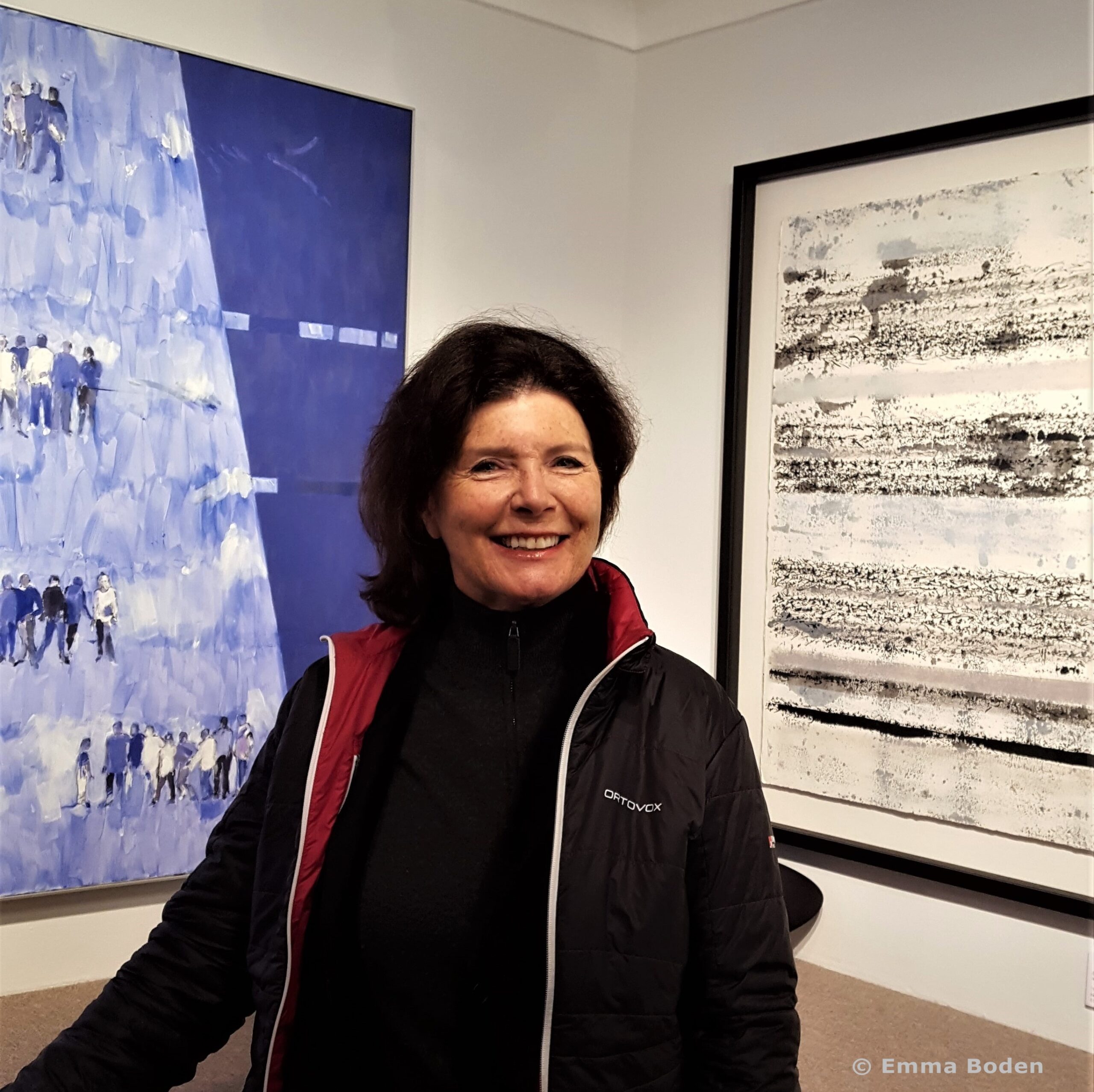
Zoë Kronberger, photo: Emma Boden, 2017
Do you think having a scientist as a parent has influenced your creativity and if so how?
“Yes definitely. There were always conversations about flux, balance, problem solving and thinking without certain constraints. The globality of things was instilled in me at a young age. I loved my astronomy books, bird books, nature, geography and my beloved microscope and flower press.”
What led you to begin studies in graphic design?
“There was a strong childhood influence from regular time spent with my aunts, both of whom were artists, in the sixties in Zürich, where I felt a strong design influence in everything from wrist watch faces to architecture. I liked the clean modernity. The aunts made sure I looked hard and sent me into modern art museums. I would have been looking at, amongst others, works by Der Blaue Reiter and German Expressionists.
Then there was of course the US and Brit pop art scene that was emerging and which we were starting to take in visually.”
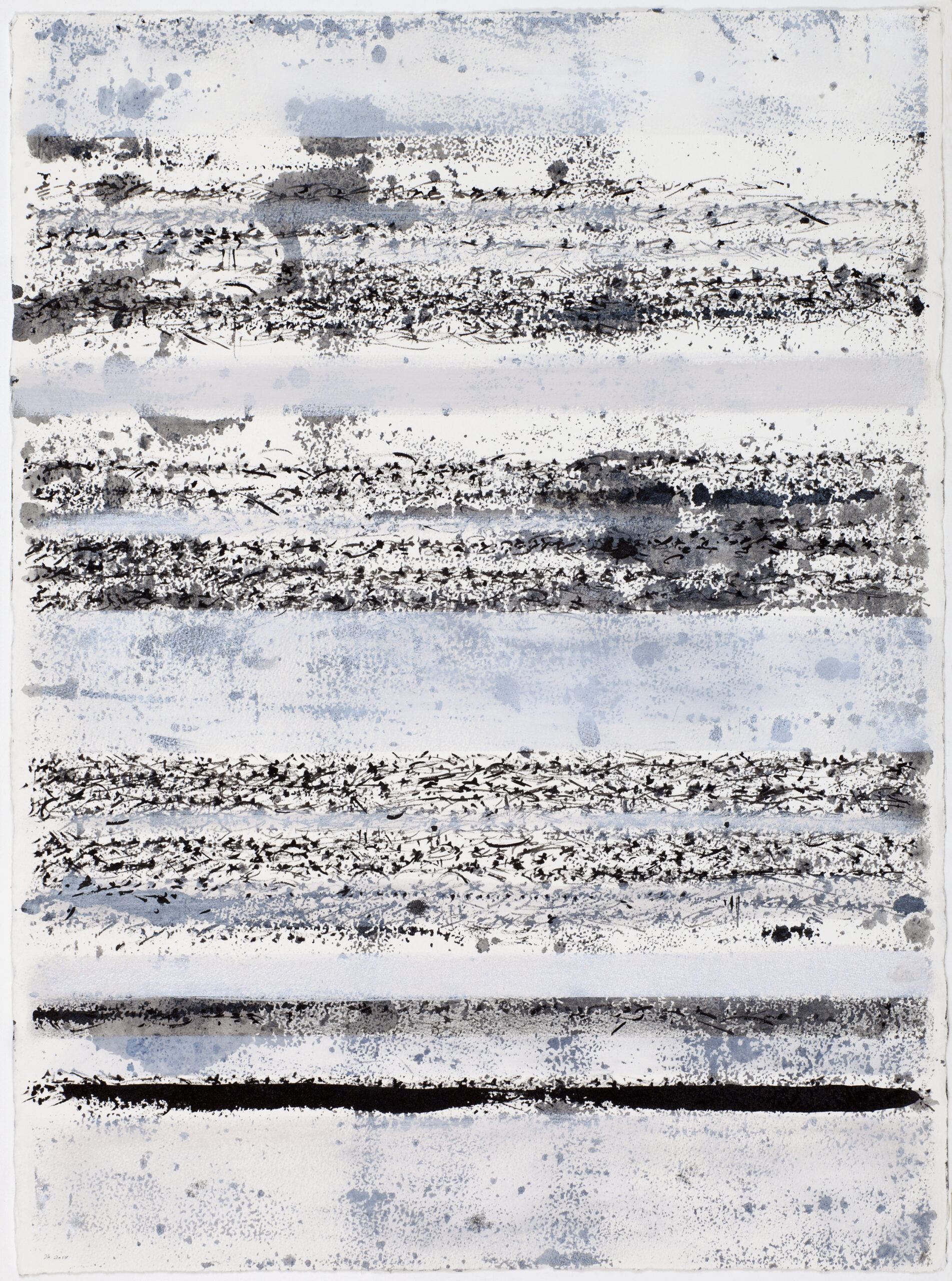
SCIROCCO, ink gouache on paper (750x550mm) SCIROCCO embodies what I feel when from around mid March in the Alps, grains of sand are blown across the med from north Africa and are pounded into the snow. The mountains take on a beige/ silvery pink appearance. Some years it is so marked that I’ve imagined music or script arriving in successive waves through the sky. If you examine the ‘score’ very closely you’ll see this. When you pass through snow of this consistency there is a markedly different sound under the ski.
Did you have any formal training in painting?
“Yes, but actually not a lot, apart from studying History of Art – and liking it – and the fact that my school days were filled with painting in most of my spare moments.
I was certainly given a lot of attention and put under pressure by my art teacher, who was tough with me but got the results she wanted. I was accepted by Manchester College of Art a year in advance with a view to doing graphic design, although she had wanted me to study Fine Art.
Manchester was probably a mistake and I only spent a short period there. I have given some thought as to what my life would have been like had I gone to one of the other colleges that offered me a place. I’m not sure it would have made that much difference in the end because the way I was thinking in visual terms just seemed to have gelled from such an early age.”
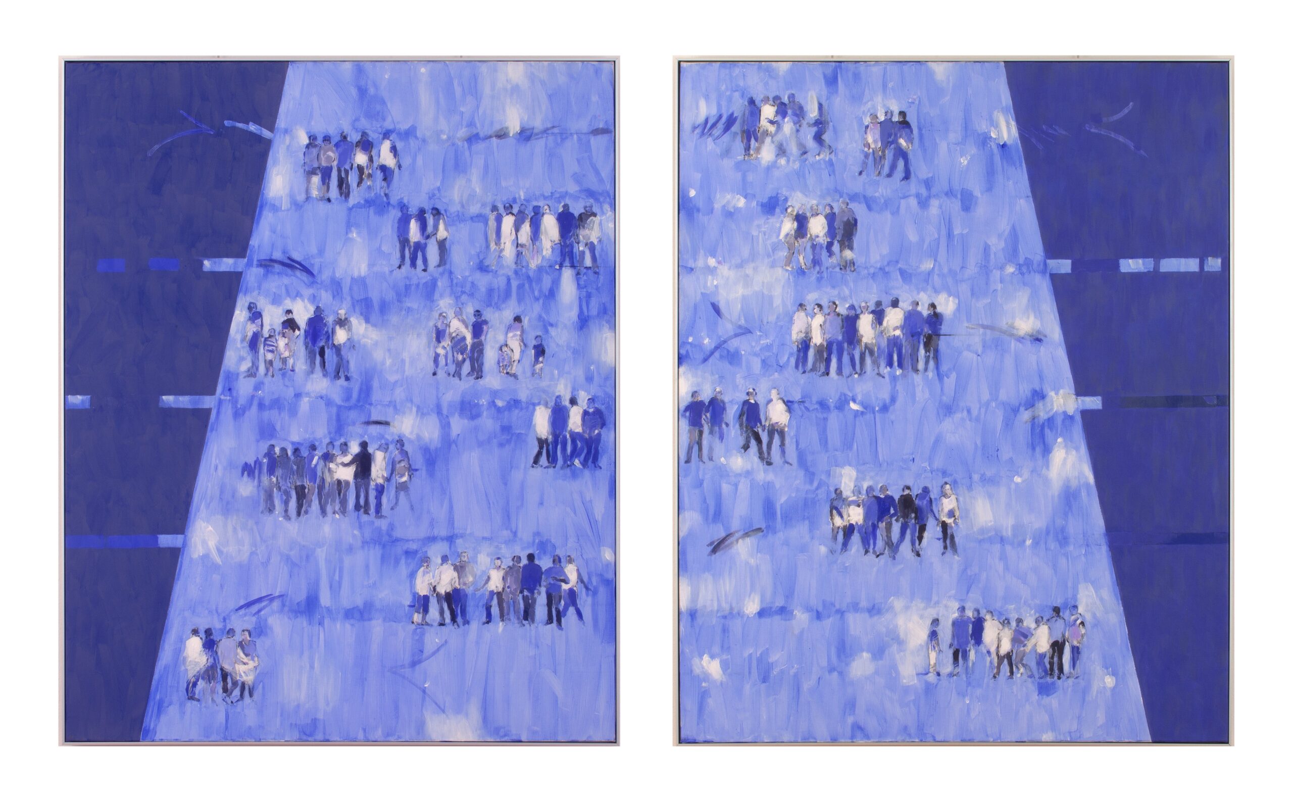
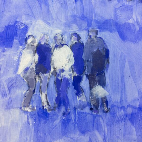
BLUE GENES, acrylic on canvas (each panel 1000x810cms) Blue Genes is a continuation of my ‘peoplescape’ work. I had the idea to comment about humankind via jeans and genes. I am using wordplay to deploy my ideas which I find can provoke a fertile thought stream. The title encompasses the words ‘genes’ as in genetic, ‘Gênes’ as in the word Genoa and therefore Gênes from where the word Jeans is said to have originated. With the palette I obtained a well varied array of colours, tints and textures – thinking about each individual human’s genetic code and perhaps their jeans too. The outer part of each work alludes to the texture of jeans. There are two small additional works called ‘Crisper’’ and ‘Red Splice’ both titles illustrating what I had in mind.
Do you see that as beneficial to your development as a visual artist?
“Yes and no. Of course I could always have had far more training– but it is perhaps precisely that lack of formal training which drove me to find my way and technique. It is a difficult exploration and will always be so it was fortuitous that I always kept up the drawing and working landscapes in situ during the music years.”
Do you see any distinction between musical artist and visual artist? How blurred or clear are those lines?
“For me the lines are indeed quite blurred as it is all a question of trying to “say it” with the same parameters and desires. It is all about choice and channeling.”
How did your project with Pierre Frey in the 90s come about?
“Pierre Frey acquired 2 works from me that they had seen and liked. They then asked if they could use them for fabric as they adapted quite well. It was the style of the design house, at that time led by Patrick Frey, to use works from artists. He liked the feel of a design that was “drawn” freehand.”
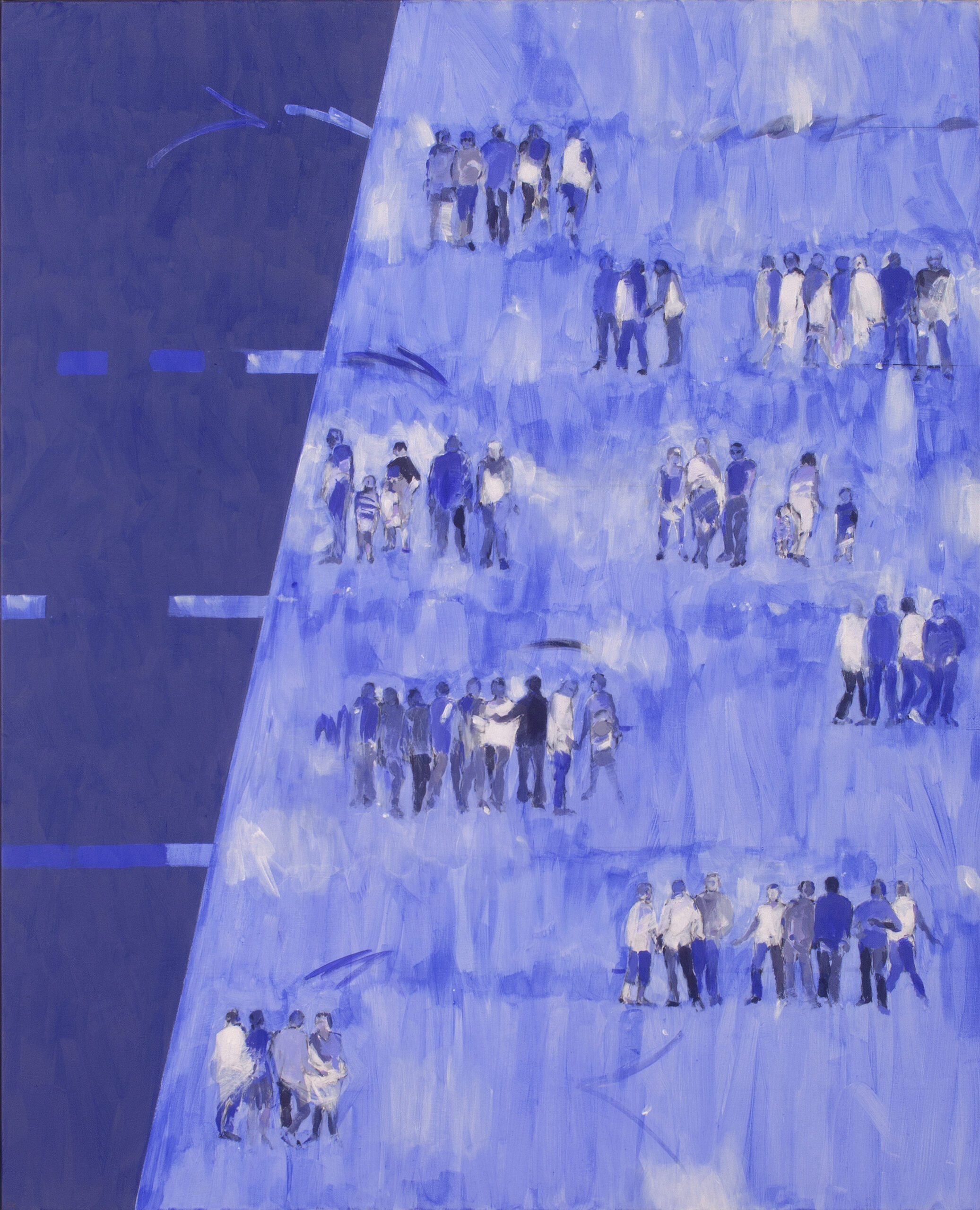
Zoe Kronberger BLUE GENES LEFT HANDED 100×81 acrylic on canvas
How has your art evolved in terms of figurative to abstract or vice-versa? Is this important to you?
“I am afraid this is like a moon that waxes and wanes, but yes – I do see evolutions, backtracking, reworking. I move easily without much self cross examination, between these so called terms “abstract/figurative”, being always principally intrigued by construction of the works and what I want to say.”
What relevance does colour have to your work?
“It depends – implied colour can also be interesting. Contrast is important.”
Any key themes that have emerged through your art?
“Physicality? Balance?”
Do you feel that the French have a different approach to art and artists?
“A while back there was far more reticence in the UK – this has flagrantly changed for a certain section of artists. In France it is less showbizzy, people don’t seem to make such a fuss because perhaps art has always been more widely present in the national psyche…’vive la différence’ maybe?”
Do you paint to music or do you prefer to work in silence or both?
“Actually I work in silence, and have done for some years now. When it is a very crucial painting passage and also when I am in ‘formation/wood-shedding’ mode, I really have to hear that inner dialogue and argument with myself as if I am two separate people. The problem with music mainly being that I am far too aware of the content of the music to be able to ‘background’ it.
When it is general painting stuff – laying on grounds etc., I’ll have radio 4 books, dramas or some Radio 3 type culture playing.
Very occasionally if I really do want or need music to ‘wig out’ to and transport me whilst painting I’ll listen to favourite but extremely diverse styles of music.”
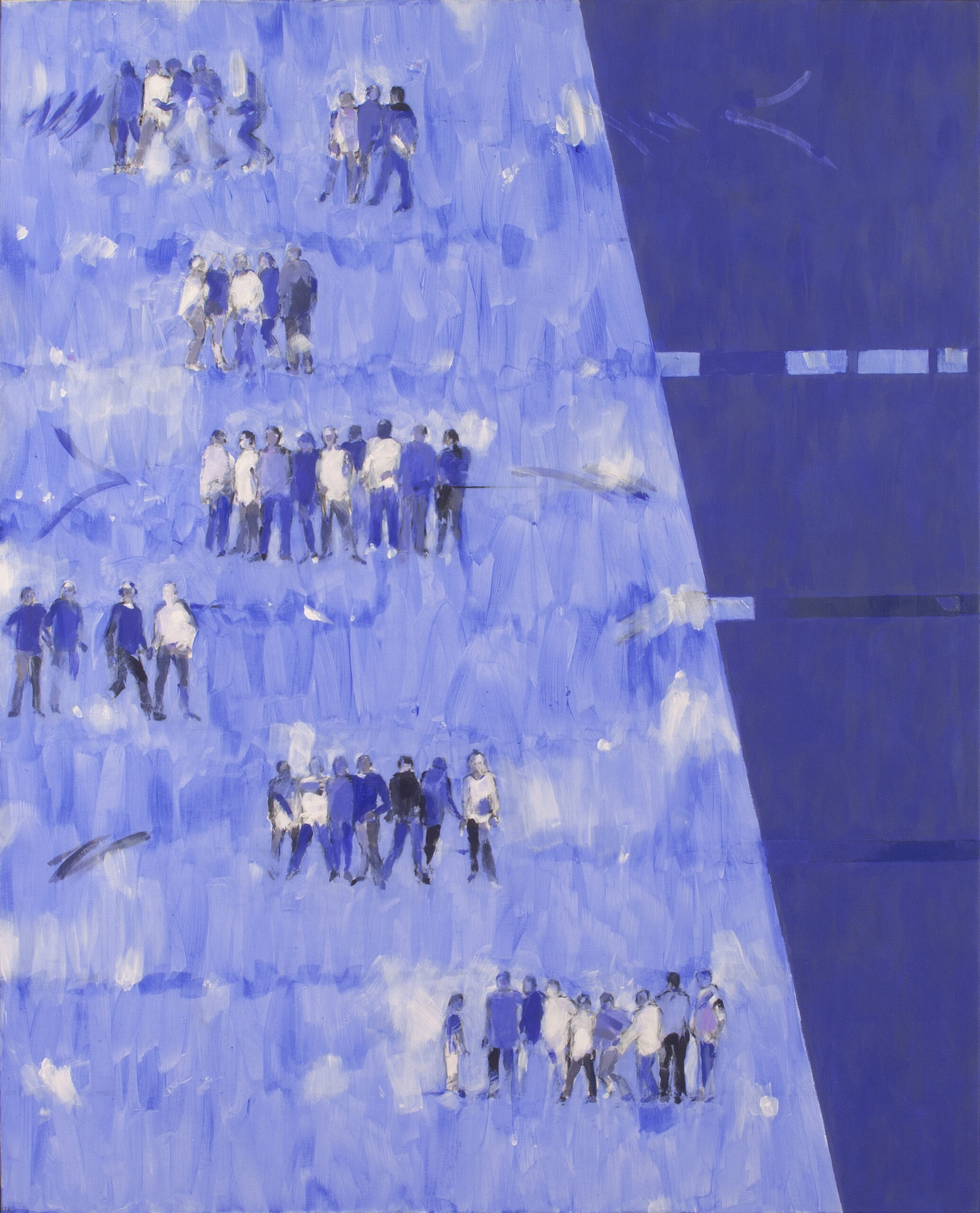
Zoe Kronberger BLUE GENES RIGHT HANDED 100×81 acrylic on canvas
This is your first solo exhibition in the UK. Any reflections about that and how the exhibition has been received?
“I enjoyed doing this show as the feeling of ‘returning’ has naturally been important to me. Although I have had my works collected in the UK for quite a few years, it was frustrating that a wider audience could not see some physical examples. I feel that in some senses my attitude to art and music has always been quite Brit – as after all this is really where it all started to develop and so yes, it’s good to feel part of my country.”
Are the skiers/mountains an on-going project?
“Oh, I would think so. There is much to draw from and challenge oneself with. I don’t really see it as a skiers and mountains project – it is painting to me.”
Do you see this strand continuing or are you looking to develop completely new projects?
“I’ve always got certain recurring strands of interest, they seem to be inherent. For example the ‘Peoplescapes’, ‘Human’ etc., ‘Suspension’…
I am very interested in developing a show which combines my music and the art and have ideas as to how this might be done and hope this will happen. I think I am now getting to the point now where I really understand how the two aspects have been working together in my case.”
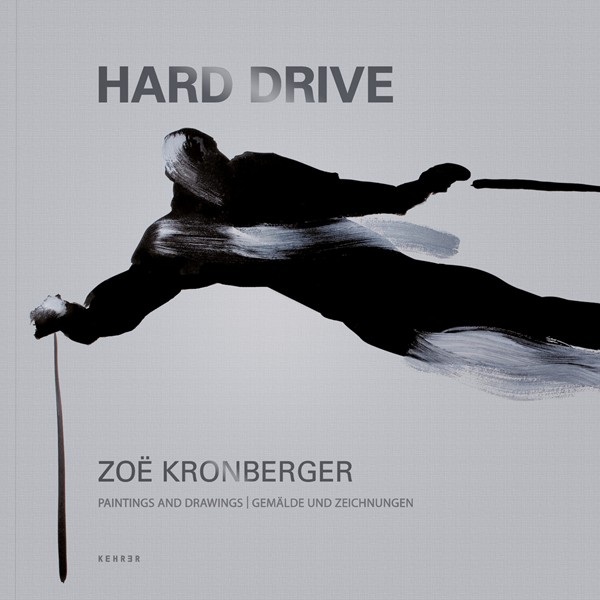
Hard Drive, Zoë Kronberger book cover
Soft Landing runs at Wimbledon Fine Art in SW London until 6th January 2018.
View more of Zoë’s work, and information about current and forthcoming exhibitions on her website.
Text © Emma Boden / Interview Zoë Kronberger
Images: Portrait of the artist © Emma Boden, all other photography © Zoë Kronberger